KG STUDIO
To grow my small business strong and impressive, I attempt to design something simple, clean, and orderly. I chose the abbreviation of my given name and surname to create a remarkable logo. As a graphic designer and photographer, I chose the colour pallet based on red, black, and white as of primary colours that are using in photography and graphic design. After research and study about principle forms of letters K /G and Letters ک / ق by simplifying the combination of all these four letters from two different alphabetic arrangement and also the vigour of the golden ratio that is considered in the design process, resulting in a remarkable outcome.
Future Sustenance Logo
FUSU stands for FUTURE SUSTENANCE. The insight of the logo is to illustrate leftover foods, plants grow, change in human body shapes, fat to fit.
Macleay Musume logo
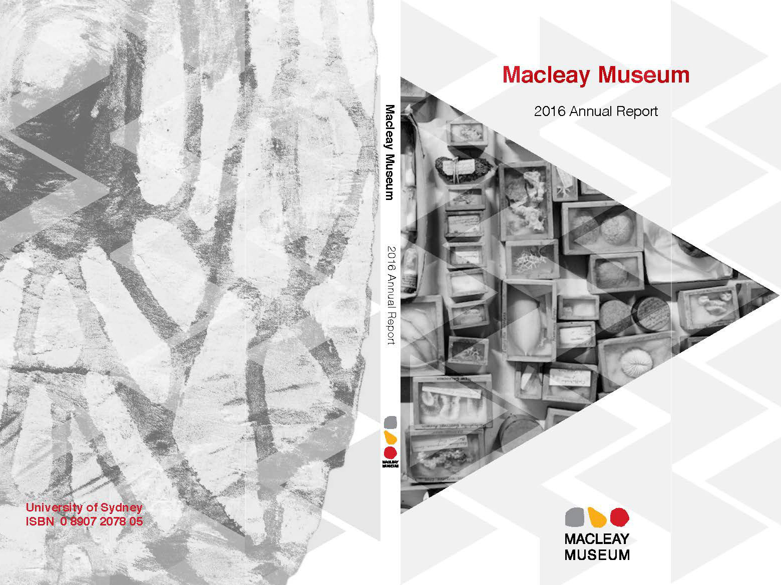
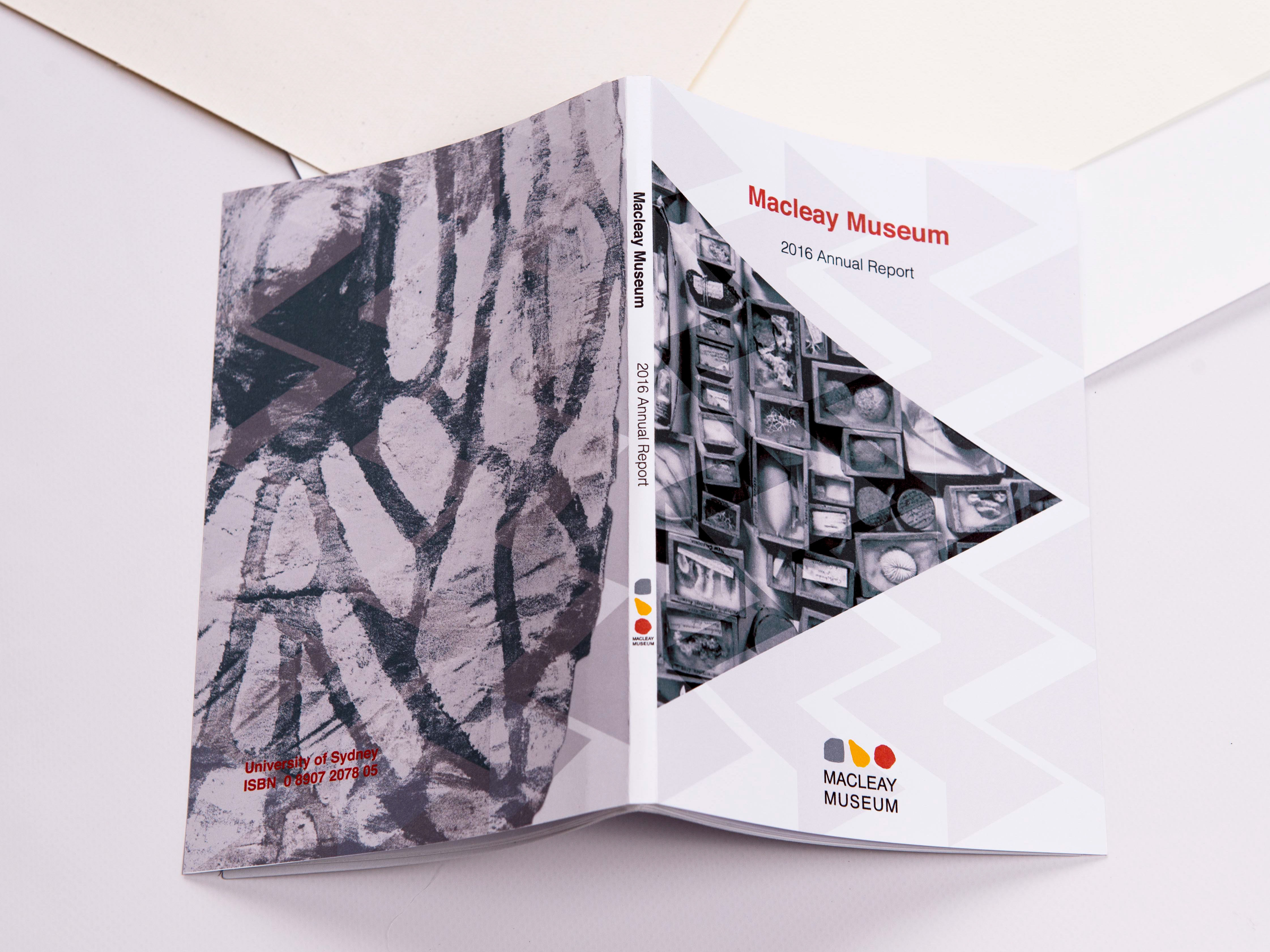
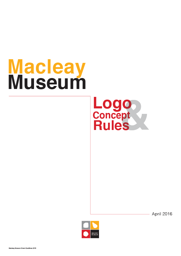
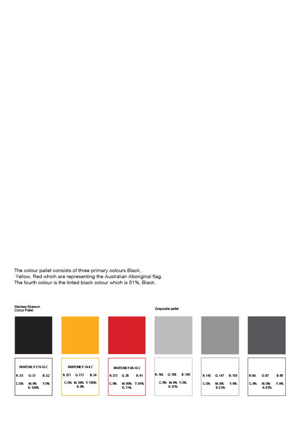
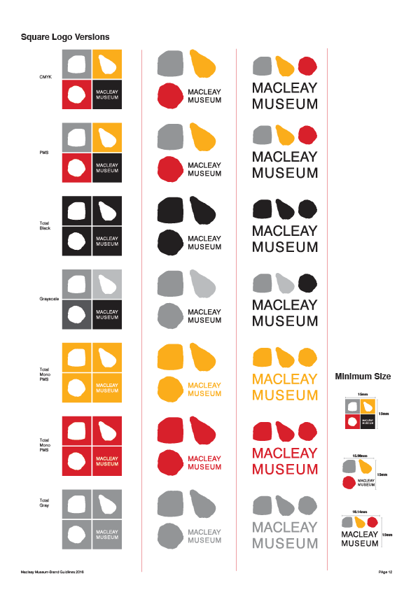
Stone Age, human development, and butterfly evolution are the Macleay Museum logo design inspiration. The design possesses started with the fundamental geometric shapes like square, triangle, and circle. The first sample was very geometric with sharp corners. In the next stage, organic corners added to emphasise more on the evaluation. It would be the simplest way that the logo possibly could convey the evaluation message. Research on Australia history and the Macleay Museum uniquely their stone collection was a great tool to finalise the logo. Human attempts to shape the material world since discovering how to carve the stone to make tools and wheel which made their first appearance about 2.6 million years ago. NM47.140, NM63.96, and NM48.80 are the item numbers that Macleay museum is keeping them in one of their precious collections. I replaced the silhouette of these shapes with the geometrical ones. A four-panel window with four colours represents the act of seeing or watching; also, it expresses the different sections and collections of the history that the Macleay Museum exhibit them to the viewers. The four-panel square window is simplified shape representing butterfly. The employed colours are expressing Australian aboriginal values and rituals. These colours picked from the Australian aboriginal flag. The employed colours also are prevalent in Australian aboriginal art.
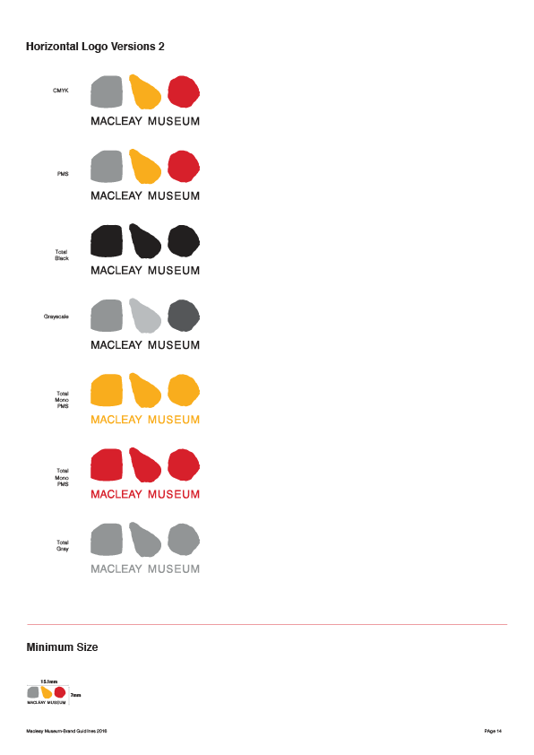
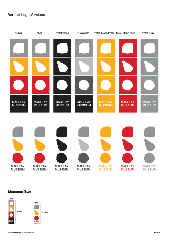
Macleay Museum logo rules


One World EHR Consulting
Make me Sushi logo


